
Irene Falgueras and Joosep Laht, two product designers at Goodnotes, take us through a behind-the-scenes of how Goodnotes’ new UI came to be.
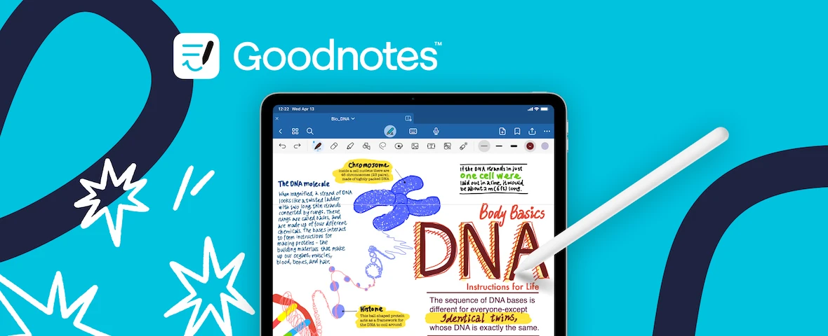
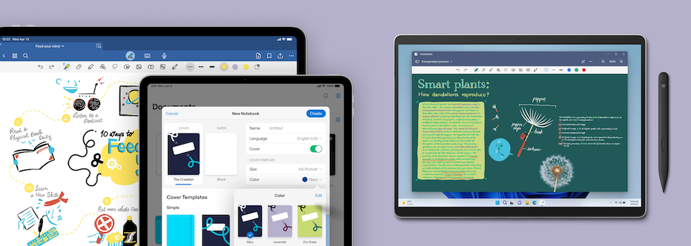
In August 2023, we launched the all-new and reimagined Goodnotes. It is packed with never-seen before AI features, study materials, and more wrapped inside an exciting fresh new interface.
This is the biggest release in Goodnotes’ history, and we are here to tell you a bit more about how we went through the process of redesign the Goodnotes experience. So let’s get started!
Firstly, why did we redesign the app?
Back in November we were given the challenge to bring in a new look and feel to the upcoming version of Goodnotes. The task at hand was not simple, with an ambitious launch date, we needed to work out the best strategy for redesigning the entire app.
So our team joined forces to face the challenge, and narrowed it down into several objectives:
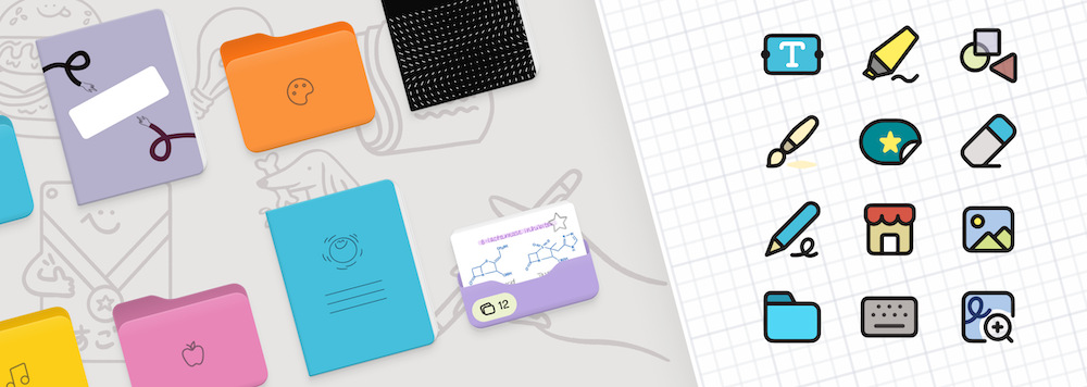
- 🎨 Adopting the new branding for Goodnotes 6: from the bright new colors and fresh typography, to developing a new icon set and implementing an illustration system that could scale over time.
- ✍️ Improving the core editing experience: rethinking the experience, making room for the newer app capabilities and what’s yet to come.
- 📁 Evolving the overall app information architecture: considering the new content and growing business, exploring the optimal navigation experience in app.
Ultimately we agreed that our new design direction should be an evolution not a revolution, retaining the core experience and workflows that people know and love.
So where did we start?
With a blank piece of digital paper, on which we started collecting lots and lots of references and inspiration from a variety of places: apps we love, industry trends, the latest best practices from the different platforms, and conducting desk studies on younger audiences and their unique preferences.
Parallel to our initiative, our Marketing team had embarked in the exciting journey to develop our new brand and tone of voice for Goodnotes. To align with that, we mapped our brand attributes following the Microsoft Desirability Toolkit framework, allowing us to have some guiding principles to use as reference while brainstorming.
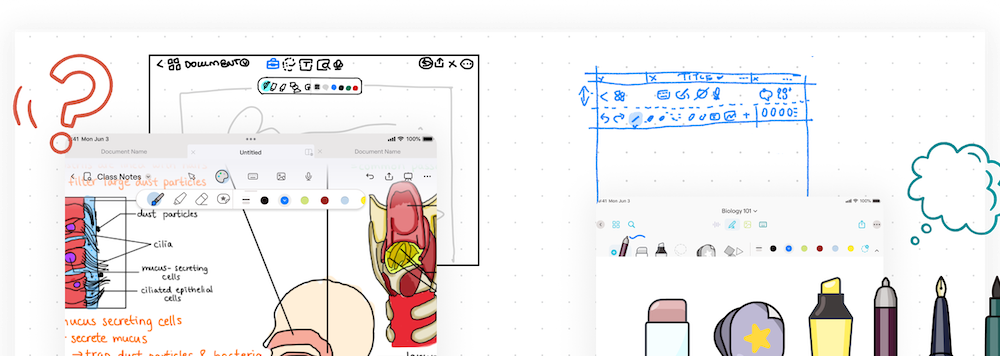
Thanks to the research we’d done and having a tone of voice to lean on, we were able to pinpoint what could work and was worth experimenting with throughout the concept development process. Our main tool to keep us moving forward and narrowing down ideas was going through multiple critique rounds with designers and colleagues, sharing the work in progress sketches.
When we were happy with a few concepts, we went ahead and tested them with a mix of existing Goodnotes users and participants who hadn't used the app before. Our aim was to test and validate what aspects of our experiments were working out and were aligning best with the attributes we had set for our new brand.
How did we decide on the final direction for the redesign?
Our initial goal with this redesign was to evolve our visual language to a refreshed version of the now former Goodnotes, that feels familiar and delightful to our existing users, but also draws in a younger audience.
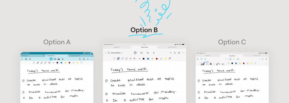
We were able to collect insightful learnings from the interviews we conducted around our concepts. It was an interesting process as opinions can be very subjected to everyone’s personal preferences, but we were able to identify several common themes. For example, the compact and playful icons were a hit meanwhile the realistic tools were too distracting. Also the colorful navigation options was slightly more popular, which led us to later on tweak this option.
We based off our final direction on this feedback, as well as internal input from multiple colleagues. We had done it! The final direction was set. Now the actual work of redesigning the app from beginning to end had to start.

What makes this new look so special?
You might have heard the news that Goodnotes is now available across multiple platforms, like Android and Windows. Introducing a consistent look and feel across devices and platforms was essential for us. At the same time, we wanted to respect each platform’s native environment.
With this goal in mind, we focused on infusing our personality with beautifully crafted illustrations, vibrant colors, icons and some delightful moments (have you noticed the cute designs on our new loading screens?).
Lastly, what did we enjoy most about this process?
Definitely the most enjoyable parts have been seeing the team excitement as the project was coming to life. It has been truly a labor of love, from crafting every new icon to testing screen by screen checking the designs worked as expected. We want to thank everyone involved in this launch that has made it possible to bring our users the delightful new look and feel of Goodnotes. It’s also exciting since this is just the beginning. Our minds are filled with ideas and backlogs full of user requests and we are actively working on them to help your digital note-taking experience become even better.
We cannot wait for you to give it a try and love it as much as we do. You can try out the new Goodnotes over in the Apple App Store, or check out Goodnotes for Android and Windows.
If you want to reach out to our design and product team, don’t hesitate to tweet us @goodnotesapp with your requests so we can continue improving our beloved app.

